Feature Integration - Mobile
Slack Family
Project
Concept
Timeline
2 weeks
Tools
Figma
Miro
Main Role
UX Researcher
UX Designer
Team Members
Ryanne Ross
Slack is a collaboration hub
Slack Family integrates new organization features
that brings people, information, and tools together to get work done. People around the world use Slack to connect their teams, unify their systems, and drive their business forward.
to work not just for families, but also for housemates, friend groups, and any kind of small, intimate assembly. When designing Slack Family, my partner and I wanted to make sure to stay loyal to the overall UI and information architecture of the existing Slack, while seamlessly accommodating a couple useful, integral features that any group of people who want to share plans and make memories together can enjoy.
Research
Together, we interviewed six different users.
We focused on exploring how the users communicated with their families, what they specifically found difficult to coordinate, and the potential of an app to make that process easier.
Key Insights
Users only want to share general calendars based on personal and group relevance; when its beneficial on a need to know basis
Users also need an easy way to manage invites, to avoid forgetting anyone and to check who is attendingScheduling/ planning is hard; Users need better ways to communicate schedules with each other to let each other know availabilities easily
Users coordinate, stay in the loop, send pictures/articles/ and coupons amongst each other
Group chats are confusing when left unchecked; too many topics, messages and lagging texters
Calendars are more for planning far out events
Indications of timely messages are needed for small group chats when sharing day to day schedules
Sharing images can be cumbersome; there can be a decrease in quality, storage limits via email, or phone compatibility issues and they are hard to reference back to
Created on Miro
We also conducted competitive and comparative analyses, comparing Slack to similar apps like Cocoon and Discord, and comparative apps like Instagram and Facebook.
We realized that although all of these apps had very distinctive common features across the board, Slack was missing a lot of features that made the other apps more attractive and useful to the everyday user, versus Slack’s more team/business-oriented options. This included the option to indicate certain messages as more important or urgent, collaborative calendar options, and a display system for photo organization.
We then synthesized our research and created two main personas to align our design process. Going back to our original hopes to create an app that functions both for families and other small groups, we created two personas: Darryl, who represents families, and Marie, who lives with a small group of friends.
Darryl
Marie
Darryl is a suburban dad of 4 really active kids. Not only does he have a family of 6, but he also comes from a very large, close extended family, and communicates with his family often.
Goals/motivations: Family oriented
Darryl enjoys a hands-on approach to parenting and is really involved in his family. He likes to plan holiday get togethers and vacations with his extended family. His parents live in a different state, so he likes to keep them updated by sending them pictures of his kids, and inviting them to special family events.
Needs: Organization (Work separate, Family separate)
In between all of the activities his kids participate in and all the family get togethers, Darryl is a working parent who is constantly juggling being an active parent and his work duties. Darryl needs a way for him to have all of his family content and communication in one place, so he doesn’t get it mixed up with his work
Pain Points: Communication within his family
Darryl’s main pain point is not being able to communicate and plan things easily with his family. His kids are forgetful and with so many family members, he can have a difficult time finding a date that works, figuring out the details, and inviting everyone on his list.
Marie is a college student, currently sharing a small apartment with 4 friends. Given the apartment’s size, nearly every item/space in the house is communal and shared according to schedule. She is close with her roommates and relies on them a lot, as her family lives out of state.
Goals/motivations: Peace in the apartment
Marie enjoys living with her friends, and wants to be able to make the most out of their short time living together. In order to do that she wants to prevent conflict by being sensitive to each others’ needs or opportunities to spend time together. She also wants to be able to preserve the memories they make together in an organized, easily accessible way.
Needs: Keeping track of what’s important
Refrigerator, meals, bathroom usage, and even the tv are just the beginning of what’s shared between the five girls.
Although people try to call dibs and plan out their usage ahead of time, it’s difficult to keep track and know what’s going on. Marie and her housemates need a way to organize their wants/needs clearly, so they can keep track and be respectful of others’ needs.
Pain Points: Knowing what’s important
Marie currently works as a barista in a small coffee shop near her university. With five girls in a single apartment, there’s always a lot going on and a constant stream of announcements/polls to be made. Because Marie can’t easily check her phone during her shifts/classes, she’s always missing out on important things. She needs to be able to check the most important messages easily, so she doesn’t have to spend a lot of time digging for old messages and catching up.
Darryl’s journey map
shows his current process with scheduling an event, finding availability, and inviting others. As you can see, there’s frustration with looking for an event date that works with all his guests, and managing his invite list. We’re able to see opportunities to create a space where the user can quickly start communicating, create a collaborative calendar, and manage an invite list.
Marie’s journey map
also shows her current process with going back and forth from active/previous group chats and saved photos. From here, we noticed opportunities to highlight certain notifications that are urgent, display relevant photos in one spot, and make the process of finding previous resources like photos, event dates, and etc more quickly.
Problem Statement
Darryl and Marie need a way to organize all of their household affairs and communicate quickly and easily with their members, so they can coordinate schedules, plan events, and conveniently share/keep track of the memories they make together.
Solution Statement
We believe that by adding calendar, photo album, and chat indicator features on Slack Family, we will make the app more comprehensive of family/roommate friendly needs, and make scheduling and keeping track of household affairs more convenient.
Ideation
Design Studio
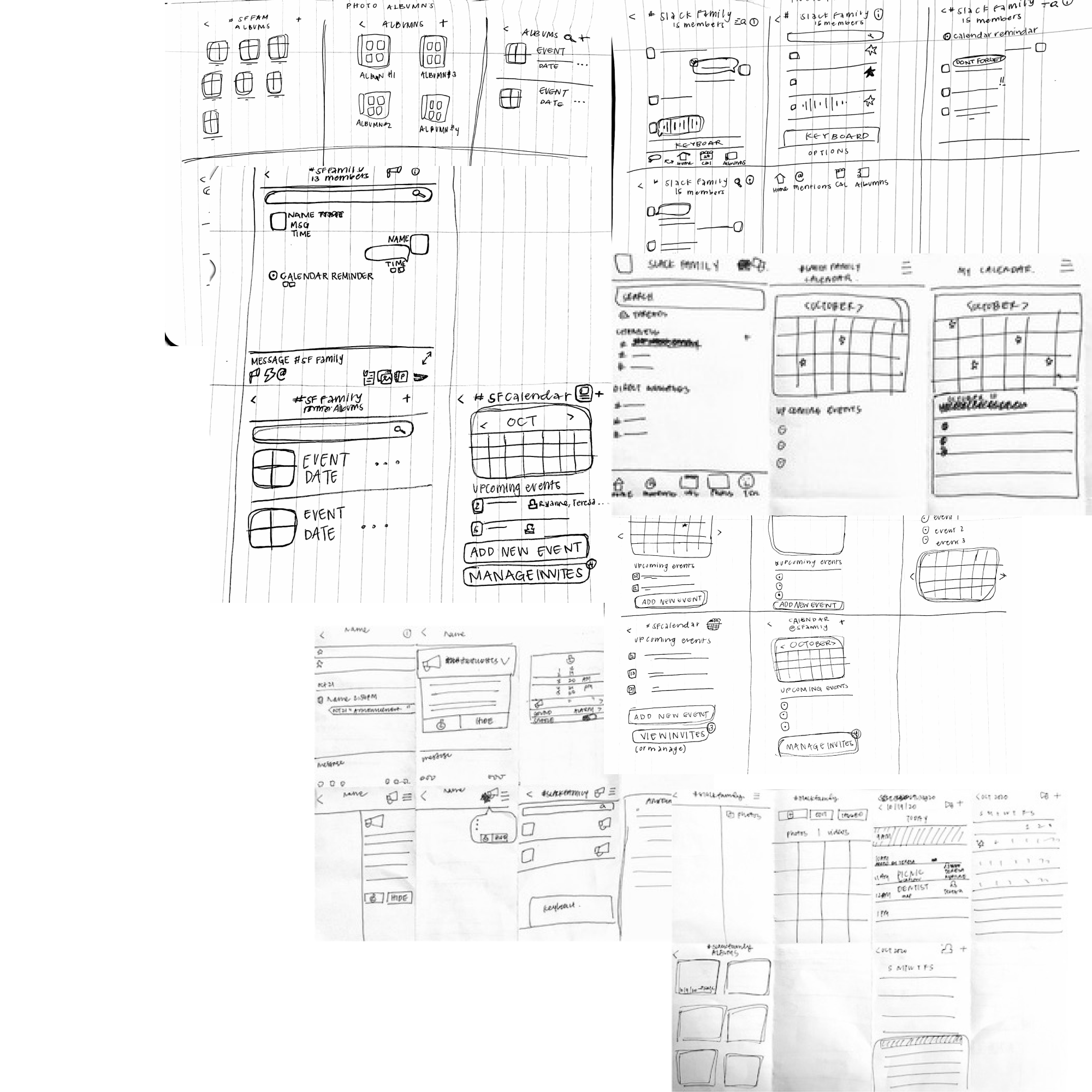
Crazy 8 sketch sessions and numerous back and forth at the drawing board drove our ideation process. Our priority during this process was focusing on the user’s needs, and the practicality of the features we were envisioning.
Keeping in mind the opportunities we found in Darryl and Marie’s journey maps, we added a calendar option to easily invite others to events, efficiently manage invites, and schedule dates. We also added chat indicators to announce important and timely events within group chats, which often become buried within the fast-paced correspondence. The final feature we included was a display photo organization system, so people can find and share photos more quickly.
Low Fidelity Wireframes
After comparing designs to create new ones that best aligned with the user’s needs, we moved on to create low fidelity wireframes.
Here, we recognized that including all of the new features we envisioned could possibly overwhelm the user and work against the practicality that we wanted the app to offer.
We decided to prioritize the features that our users could most quickly integrate into their everyday lives, and postponed the chat indicator system for a future sprint.
High Fidelity Interactive Prototypes
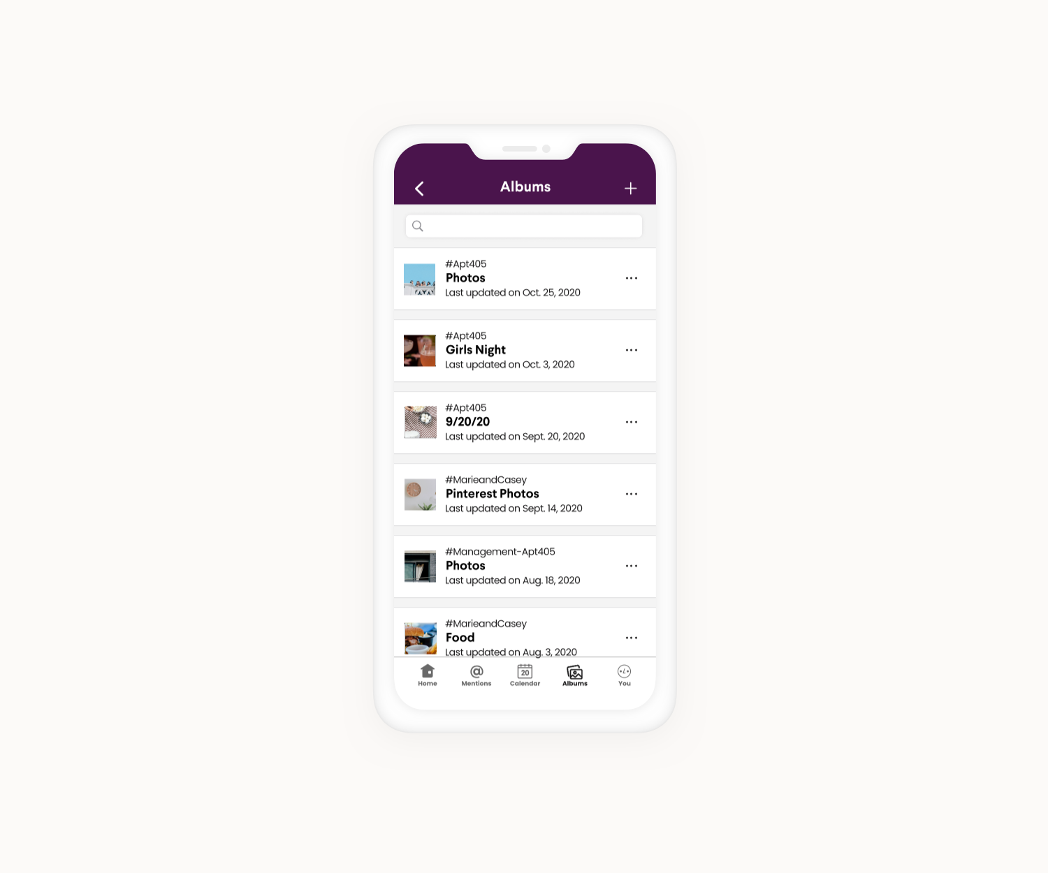
We took the low fidelity wireframes, incorporated Slack branding and colors, and brought our designs into high fidelity. Follow Darryl and Marie’s new task flows, using our interactive prototype below.
Follow Darryl’s Task Flow
Interactive Prototype
Follow Marie’s Task Flow
Interactive Prototype
Usability Testing
After creating our prototype, we conducted 4 usability tests, and gathered these key insights.
Everything was pretty straight forward and clear
- All users were able to complete tasks quickly with minimal errors
- A user who already has Slack, said it aligned with what they use on the dailyOne use noted they would like onboarding info for chat calendars because it isn’t
possible usually on an iPhone, so she wouldn’t expect the optionUsers were a little confused about the indicators
- One user thought the announcement indicator was just a chat bubble- thrown off
by shape, it took them a moment to understand what it was
- Another user noted an indication would be needed with new announcementsOne user’s favorite feature was the ability to view all photo albums or chat specific photo album
Felt like there’s too many buttons on the bottom of photo viewer, but that sharing to channel feature was super convenient
Note: the buttons on the bottom of the photo viewer align with the design of the original Slack app
Next Steps
Following our usability test feedback, our next steps would be to
do more user testing
further develop the chat indication system
integrate the photo album into the message toolbar
and introduce features through a clear cut onboarding.


