Timeline
3 Weeks
Tools
Sketch
Invision
Miro
Whimsical
Optimal Workshop
Zeplin
Deliverables
Mid-Fidelity Wireframes
High-Fidelity Interactive Prototype
Zeplin Style Guide
IJJI is a genderless clothing label based in Los Angeles that is known for their natural fibers, vibrant colors, and interesting silhouettes. As a brand, IJJI shows their commitment to growing slowly and responsibly through their minimal styles and mindful color choices.
Current Website
For this project, I redesigned IJJI’s website to maintain their strong, unique style while making some of their website’s key components more accessible and friendly to users.
User Research
User Interviews
Task Analyses
Card Sorting
User Interviews / Task Analyses
To start my research, I conducted user interviews with 5 participants. I asked them to share their impressions on the current website. Here are some of the most notable observations:
Card Sorting
I then gathered the products from the current IJJI website and conducted a card sort with 7 participants. Because IJJI is a smaller brand that gives every style they release considerable individual spotlight, I separated each style into its own product by color for my participants.
What I noticed:
0 participants categorized the items the way they are currently categorized on the website.
Participants categorized items mainly by style, occasionally by fabric.
0 participants categorized the items by color, a main categorization on the current website.
Participants average number of categories: ~ 9
Other than by style, a dominant distinction appears to only apply to “canvas” and “corduroy.”
Comparative Analysis
Competitive Analysis
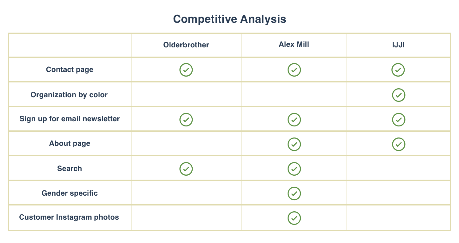
Through the analysis, I gathered inspiration from similar, small fashion brands like Olderbrother and Alex Mill. Although Alex Mill is more gender distinctive than IJJI, they do incorporate different features like customer reviews, Instagram integration, and more clearly organized information architecture, that can be very useful for IJJI’s customers.


To gather my insights from my initial research,
I found that the website’s strong branding / visual effects distract users
from fulfilling their needs as consumers on this e-commerce website.
The focus during my design process would be to make the website
more simple and direct for people to use, in terms of both UI,
but mainly navigation and clear cut information architecture.
The consequences of such a distinct style bleeds not just through initial
impressions of the website, but also in the product display pages and
actual checkout process, which is critical for conversions across the board.
Personas
Winston
“Knows what he’s looking for”
goals & motivations
Winston is not only familiar with the brand, but is familiar with shopping at similar, small contemporary brands. He values quality and really knowing and understanding a brand’s story and unique style.
needs
Winston is not looking to do a lot of casual browsing, but wants to be able to understand the brand and make a purchase as smoothly as possible.
Because he has a very distinct, personal style, and knows what he’s looking for, it’s important to him for the website to show him as many details about the clothes as possible.
pain points
Winston’s main pain point is that although he enjoys the clear branding of Ijji’s website, he finds the website hard to focus on the clothes and counterintuitive.
Sunny
“New to this”
goals & motivations
Sunny is unfamiliar with the brand, and has mainly shopped fast fashion her entire life. She recently gained interest in smaller, sustainable brands like this one. Although Sunny has a less distinct personal style, and is more into trending styles, this also makes her an easy shopper and easily adds items to her shopping cart.
needs
Because Sunny is used to shopping at larger, corporate brands, she’s used to websites that are very direct and easy to use.
pain points
Sunny doesn’t have a lot of patience for figuring out buttons / layouts that aren’t what she’s used to.
Problem Statement
Winston and Sunny need to be able to understand Ijji’s unique brand style and color, while at the same time not letting the website’s distinct color distract them from a clear and intuitive checkout process.
Ideation
With the users responses and needs in mind, I began to sketch my designs.
First, I created several versions of a new site map until I reached a design I felt best reflected my research. I eliminated the “color” categorization that was in the original design, because none of the participants in my card sort organized the products by color. I also took out the “new” category as IJJI’s slow-release, minimal collections are more driven by getting to know each style at a more thorough level as opposed to pushing out multiple frequent new releases over a season.
Mid-Fidelity Wireframes
Winston

Home

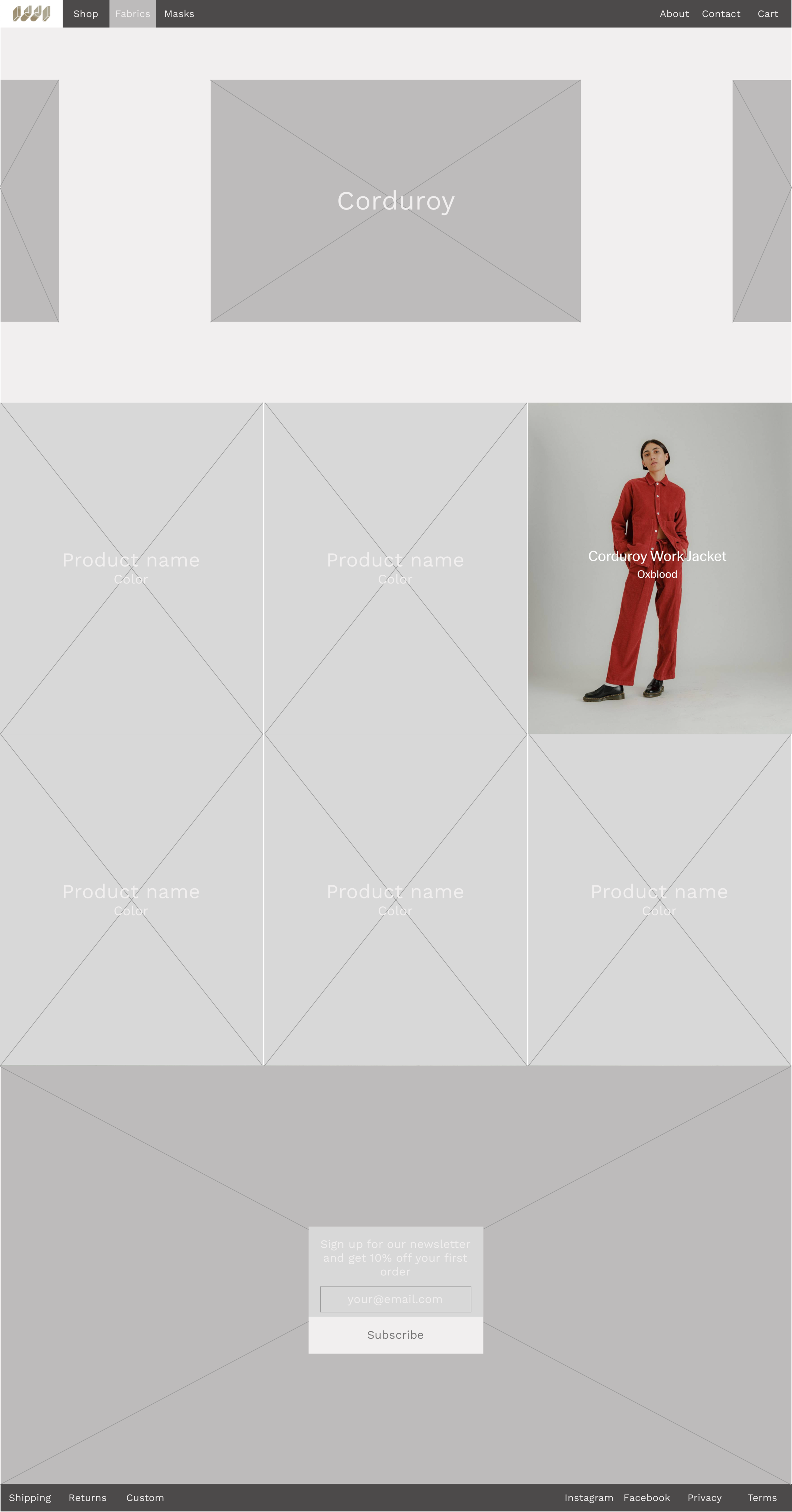
Fabrics

Corduroy

PDP

Shopping Cart

Checkout
Sunny

Home

Shop

All

PDP

Shopping Cart

Checkout
Interactive Prototype
User Testing
I tested prototype with two users from the original user interviews and noted these insights:
Users found it much easier and straightforward to use
Biggest issue was color, so the true test would be after adding UI.
Found it similar in style to original website, but without many of the excess additions that made it complicated
Mentioned that a space for customer Instagram photos, or some kind of “review” section would be helpful
Next Steps: Responsive Design & Professional Deliverables
Sketch Next, I took 5 screens from my updated designs and applied the feedback from my user tests. I brought the 5 screens into high-fidelity responsive designs on both Desktop and Mobile. They are fully atomic layouts that take advantage of all of Sketch’s features, such as symbols, named layers/groups, and document colors.
Zeplin I organized my screens and document colors on a Zeplin style guide. The document is set up for developers to begin work on them immediately, with minimal questions.
Desktop

Home

Shop All

Product Display Page

Shopping Cart

Checkout
Mobile

Home

Header Menu

Shop Menu

Product Display Page

Shopping Cart
A closer look:
Home & Product Display Page

Home

Product Display Page


